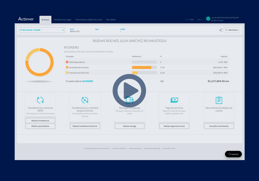
Building online banking that customers could trust

Actinver is a Mexican financial group offering investment and banking services. There was no online-banking service at the start of this project. I led UX/UI work to create it from scratch, from an initial MVP through a second interface iteration that reached production. The work covered customer research, enrolment, account access, investment information and transaction flows, in collaboration with Product and development.

Problem statement

The team needed evidence about how customers understood and used digital banking. I established a research baseline, mapped the key journeys and helped scope an initial MVP. Interviews and user testing then exposed problems that informed a new roadmap with the PM and developers. In the quarter following the V2 launch, 17,000 users registered for online banking. The satisfaction survey showed ratings of 2/5 for the first version and 5/5 for the revised experience.

  • Date

    Jul 2013 to Apr 2016

  • Client Name

    Actinver.mx

  • Tools

    Benchmark, personas, user flows, wireframes, usability testing, prototypes, UI


Analysis and benchmark

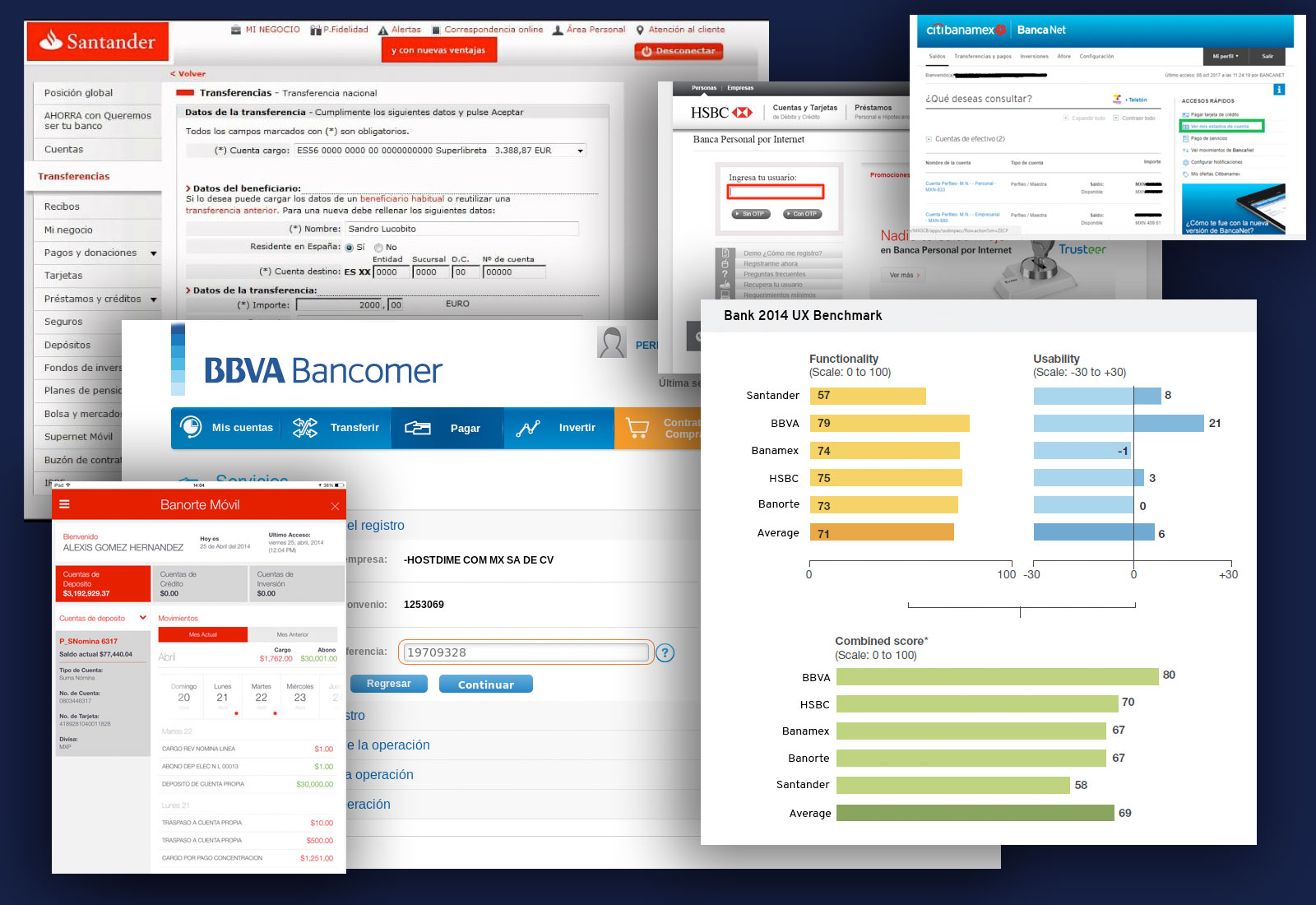
I reviewed competing digital-banking experiences to identify familiar interaction patterns and expectations for a new online service. The benchmark informed the first design priorities and gave the team concrete examples to discuss alongside customer research.

About the process

Three sources of evidence

I brought together business priorities, market patterns and customer feedback before defining the first online-banking experience.
This helped distinguish internal assumptions from customers' banking needs and concerns about moving their activity online.

1

Voice of Business

I ran a kick-off with the UX team to identify decision-makers and understand the objectives of electronic banking. This clarified who needed to review the work and where business requirements affected the customer journey.

2

Voice of Market

I benchmarked digital banking and transaction flows to understand established conventions and decide which patterns could support Actinver's new online service.

3

Voice of Customer

I interviewed customers to test assumptions about account access and transactions, then shared the findings in UX workshops so that decisions reflected user needs as well as internal priorities.


Define

Personas: different habits, different support needs

Personas

The UX team used customer research and banking scenarios to define personas for the new service. The profiles contrasted routine self-service transactions with customers accustomed to support from a bank representative. That difference informed how we approached account information, transaction guidance and access to assistance.

Person #1 Person #2
User needs

The growth of the population in Mexico with Internet access has made different business sectors seek to adapt their operations to an online plan. For some years now, the financial sector has promoted the use of digital tools that add value to their banking experience, but what are the habits of Internet banking users and why is it so important to talk about this topic?

Generation kids credit card lean kids credit card lean
Name and age group Carmen Díaz, 27-44 y.o. Luis Tinero, 45-67 y.o.
Nacionality

Mexican

Mexican

Civil status

Married

Married

Sons

3 sons

2 sons

City

Toluca

Mexico city

Studies

Bachelor's degree

Master in economics

Income

50.000 mxn

270.000 mxn

Banking Habits:

According to our study in Mexico, 39% of the population over 15 years old has access to banking services, with the payroll account (65%) being the most used financial product by users, followed by the savings account. (50%) and the credit card (40%).

The majority of these users use the online banking service at least once a month, and 30% do so because it is considered a very practical way to carry out banking operations. Likewise, 75% of the users who use banking services use it to check balances and movements, while 43% use it to make a bank transfer, and 19% pay for their services.

Media Consumption

Also, the analysis indicates that 78% of these users use the Internet because they find a benefit in the ease and mobility of the means of access; In fact, the cell phone is the preferred device when connecting to the Internet.

Navigation on social networks (95%) is the main activity carried out by online banking users, followed by information searches (93%), checking email (91%), buying online (42%), banking by Internet (25%) and make online payments (17%).

Goals

Complete routine transactions independently, including credit-card and utility payments. This profile is comfortable trying digital services but expects familiar patterns, clear labels and an experience comparable to other banking tools.

Understand the investment portfolio without losing access to a trusted bank representative. This profile is accustomed to handling operations by phone and needs reassurance when moving online. Clear financial information and a visible route to support matter more than introducing every feature at once.


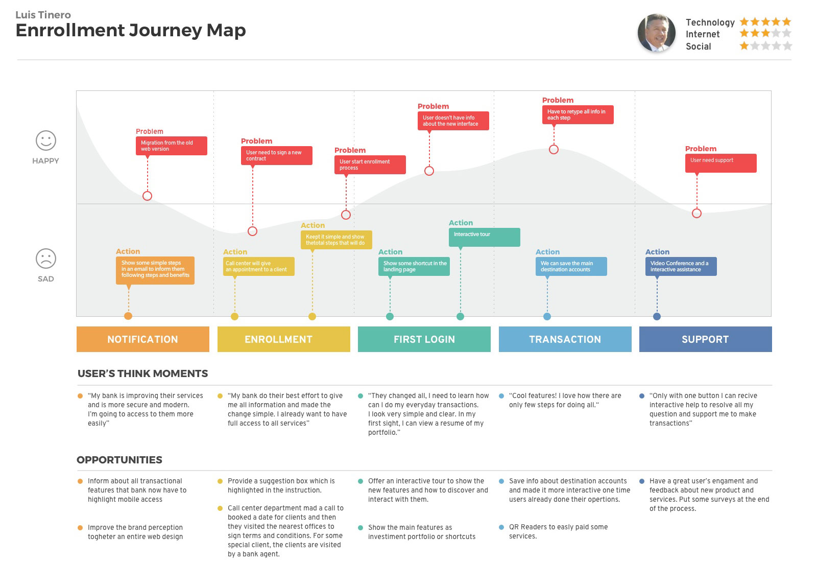
User Journey

Discovering pains and gains into
the user journey

  • Moving from assisted banking to a new online service
  • Signing the required online-banking agreement at a branch
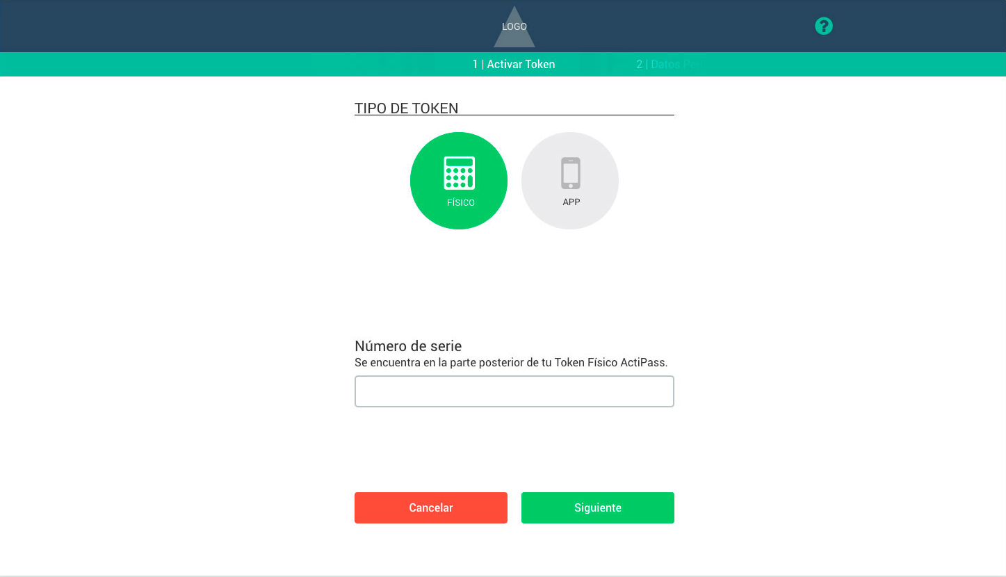
  • Enrolment and token activation
  • Understanding account access and privacy
The solution involves other departments

The journey extended beyond the interface: customers needed to understand the agreement, branch visit and token activation before they could use online banking. I mapped those touchpoints with the UX team and other bank departments. Security and confidentiality requirements meant authentication had to use a physical device generating security codes instead of SMS or fingerprint verification. Fingerprint authentication was not an approved option for this implementation at the time. The design therefore had to explain the token-dependent journey rather than suggest customers could authenticate entirely on their phone. This preserved the required security approach but added a separate device and activation step to the customer experience.


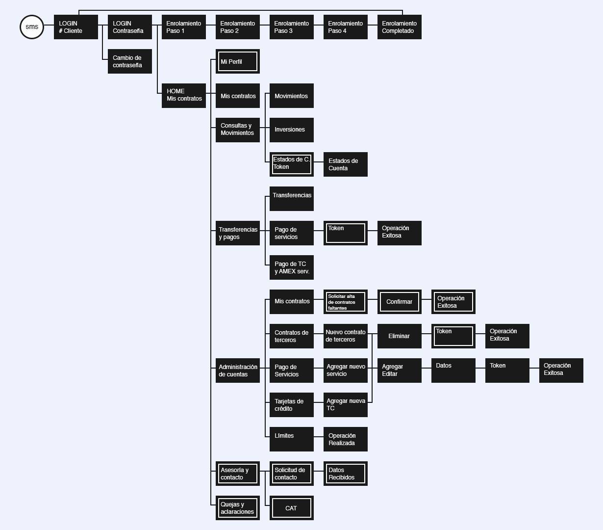
Mapping user experience

User flow V.1

I mapped the first version of the banking flow to show how customers moved from access and account information to their intended task. The map made dependencies and unclear transitions visible before the team committed to a detailed interface.


UI v.1

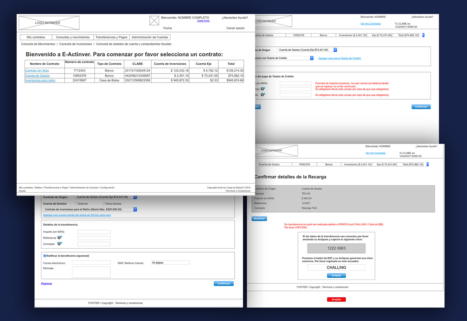
Beta version Wireframes + UI

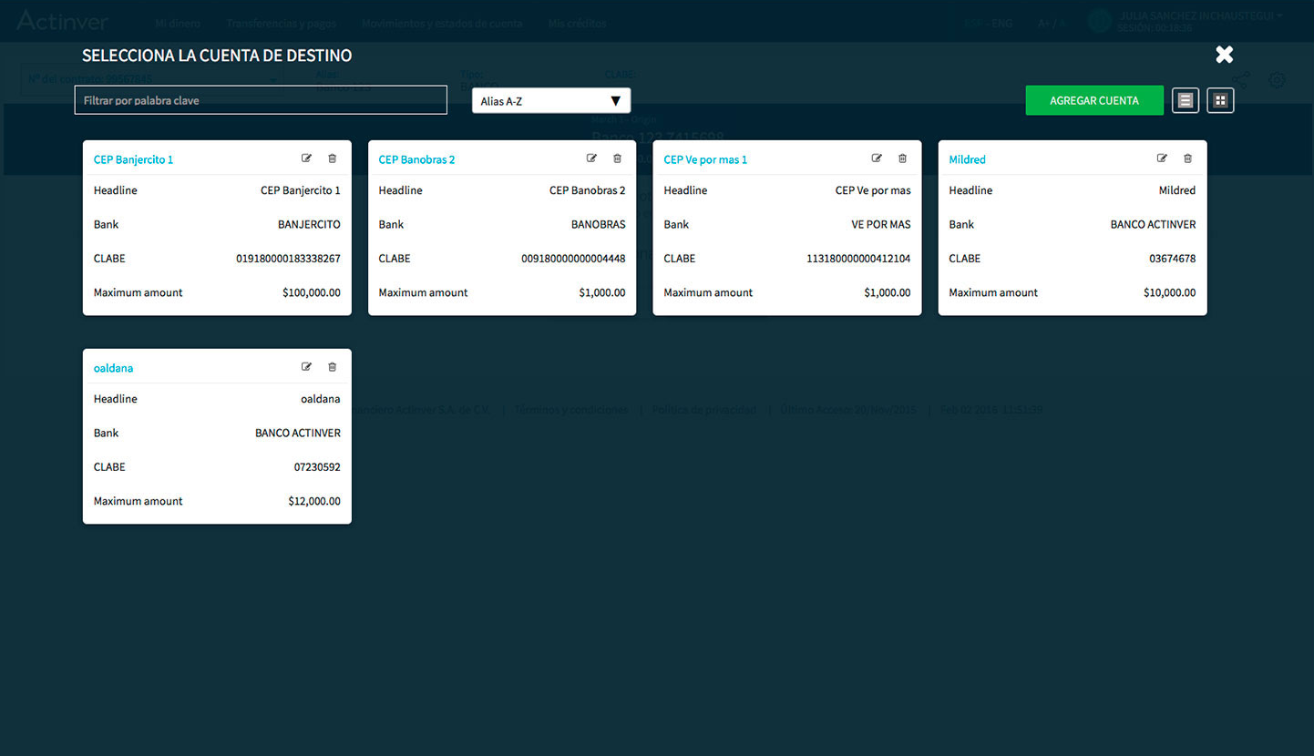
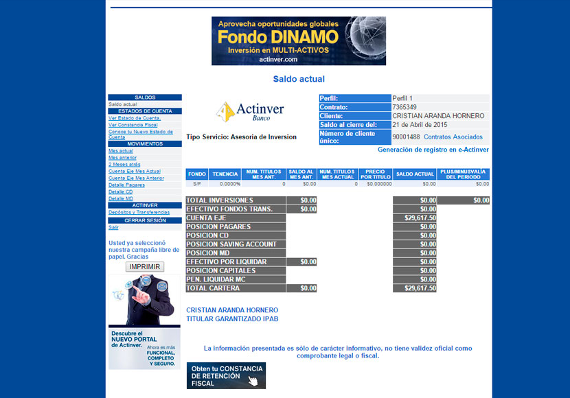
The first MVP concentrated on essential account and transaction tasks. I used wireframes and early UI proposals to review the experience with the team. Keeping that initial scope limited made the core journey available for evaluation, but the first version did not resolve all of the clarity and usability problems. Interviews and testing gave us a concrete basis for the next iteration.


Mapping user experience

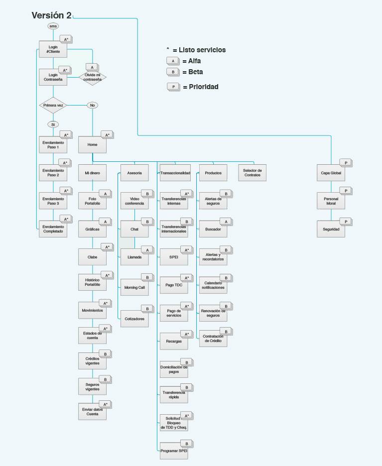
User flow V.2

The second flow incorporated feedback on the first version and made the path through key banking tasks more explicit. I revised the order of steps and the points where customers needed information or confirmation, then used the updated flow to guide the next interface iteration.


Wireframes v.2

Alpha version Wireframes

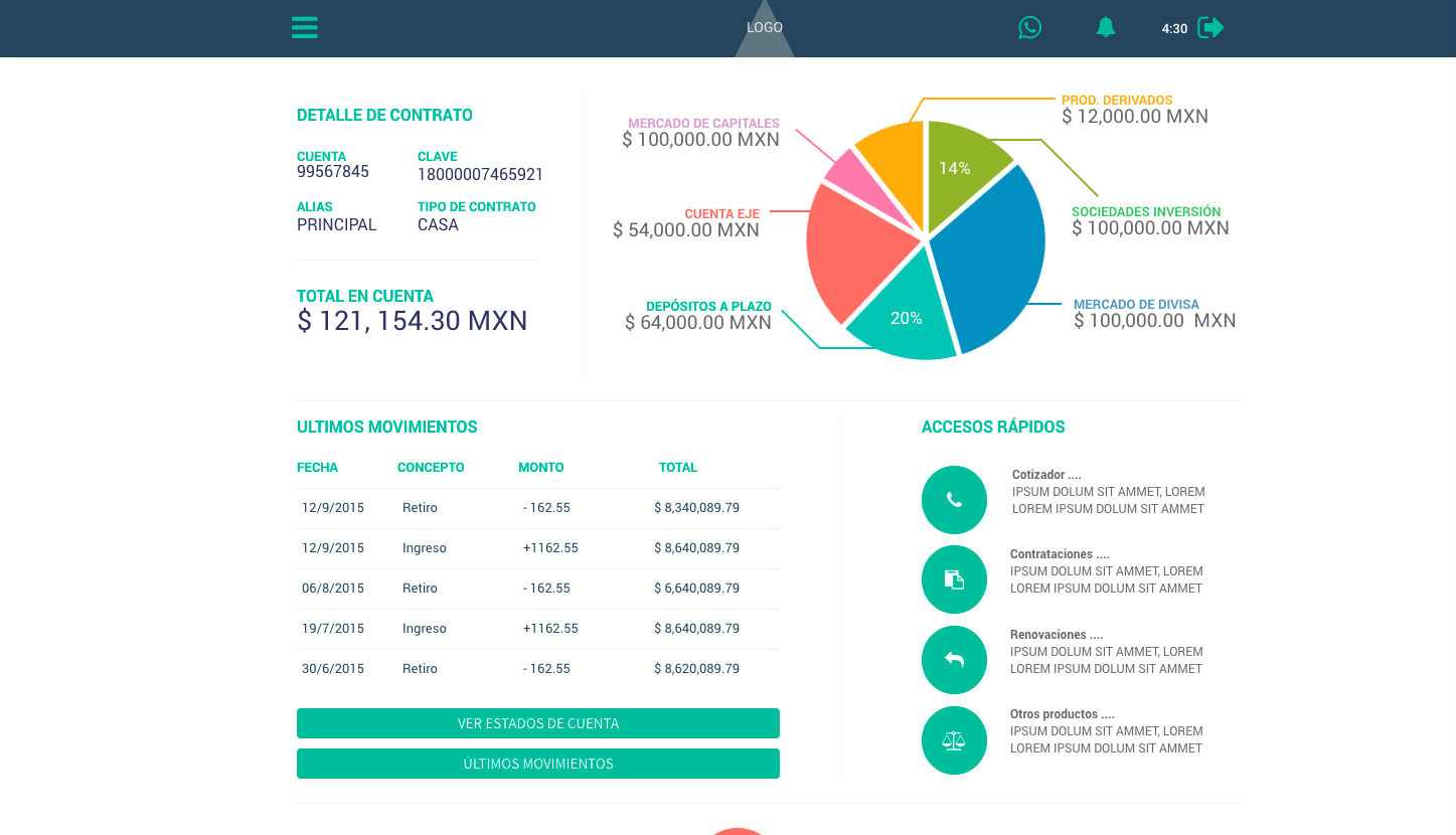
I translated the MVP interviews and testing into a revised flow and wireframes for V2. With the PM and developers, we built a roadmap to address the problems before refining the final interface. The work revisited screen order, labels, financial information and confirmation points, so the second version addressed the journey rather than only changing its visual appearance.

  • Mapped the steps customers needed to complete key banking tasks.
  • They reveal the optimal placement of key elements and content hierarchy.
  • Wireframes facilitate early testing and feedback to refine the user experience.
  • They guide the development of a cohesive and user-centered design.

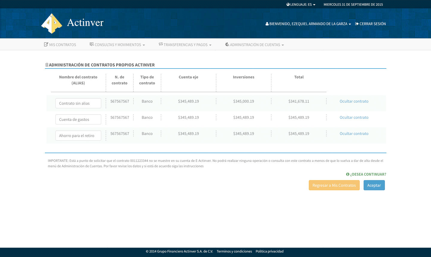
UI Design

Final UI

Data

User testing

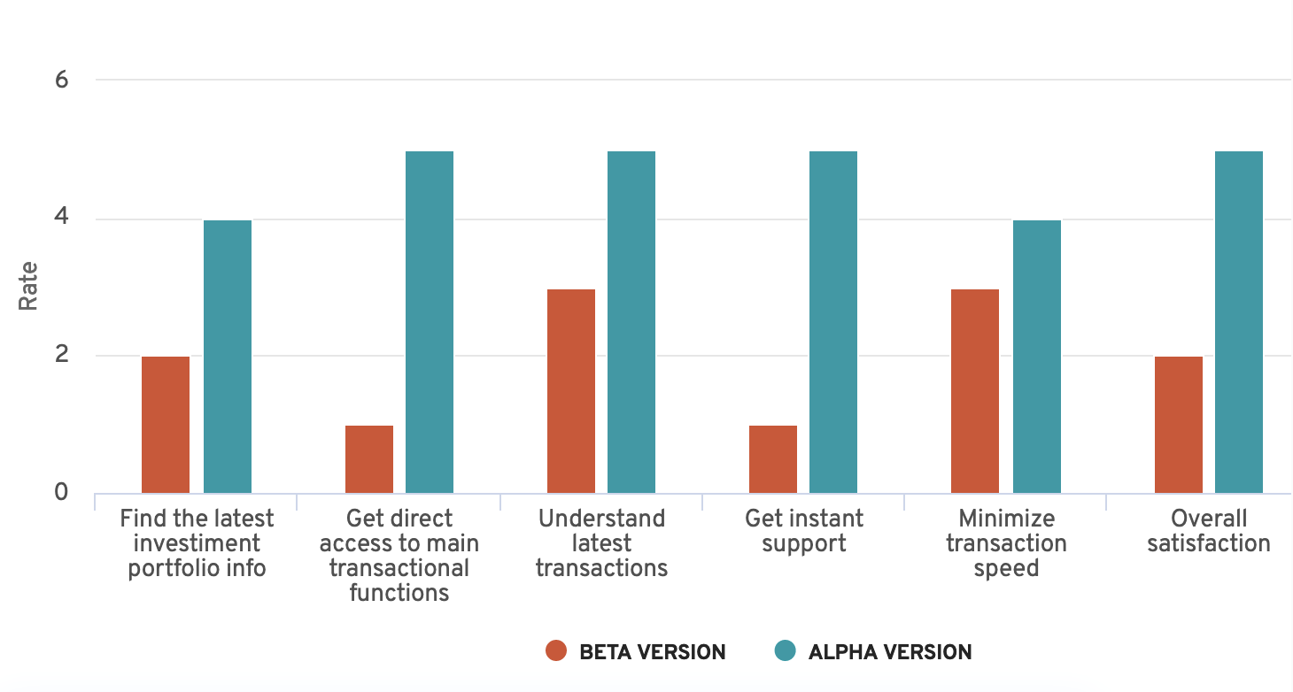
Interviews and task-based testing examined whether customers could find portfolio information, understand recent transactions and locate key banking actions. The findings informed the V2 roadmap. The satisfaction survey involved approximately 200 respondents and reported scores of 2/5 for the first version and 5/5 for the revised experience. The chart compares reported ratings; these are satisfaction results, not transaction-completion rates or a controlled measure of business impact.

  • Portfolio-information rating: 2/5 in the first version, 4/5 in the revised experience.
  • Access to main transaction functions: 1/5 to 5/5.
  • Review approval steps alongside the bank's authentication requirements.
  • Understanding recent transactions: 3/5 to 5/5.
  • Support-access rating: 1/5 to 5/5.
  • Use feedback on transaction effort to identify further improvements.
  • Explain actions and confirmation states in plain language.
  • Overall satisfaction: 2/5 to 5/5 in the reported survey.

Results

Final UI and integration

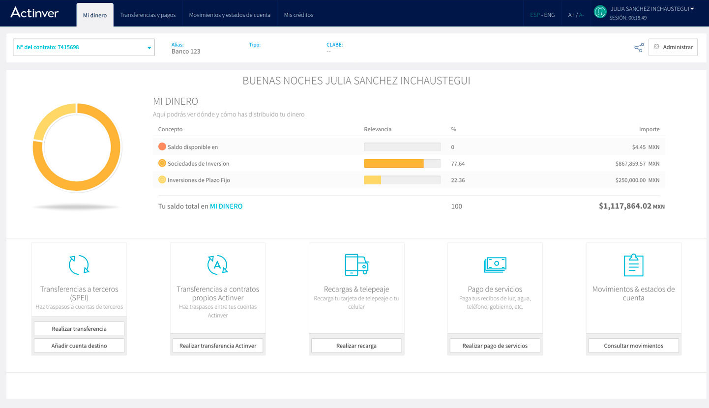
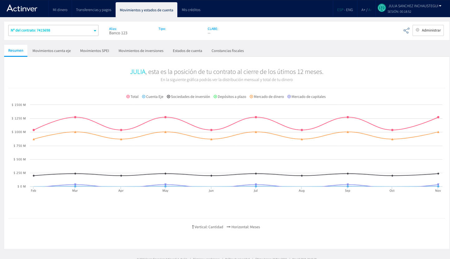
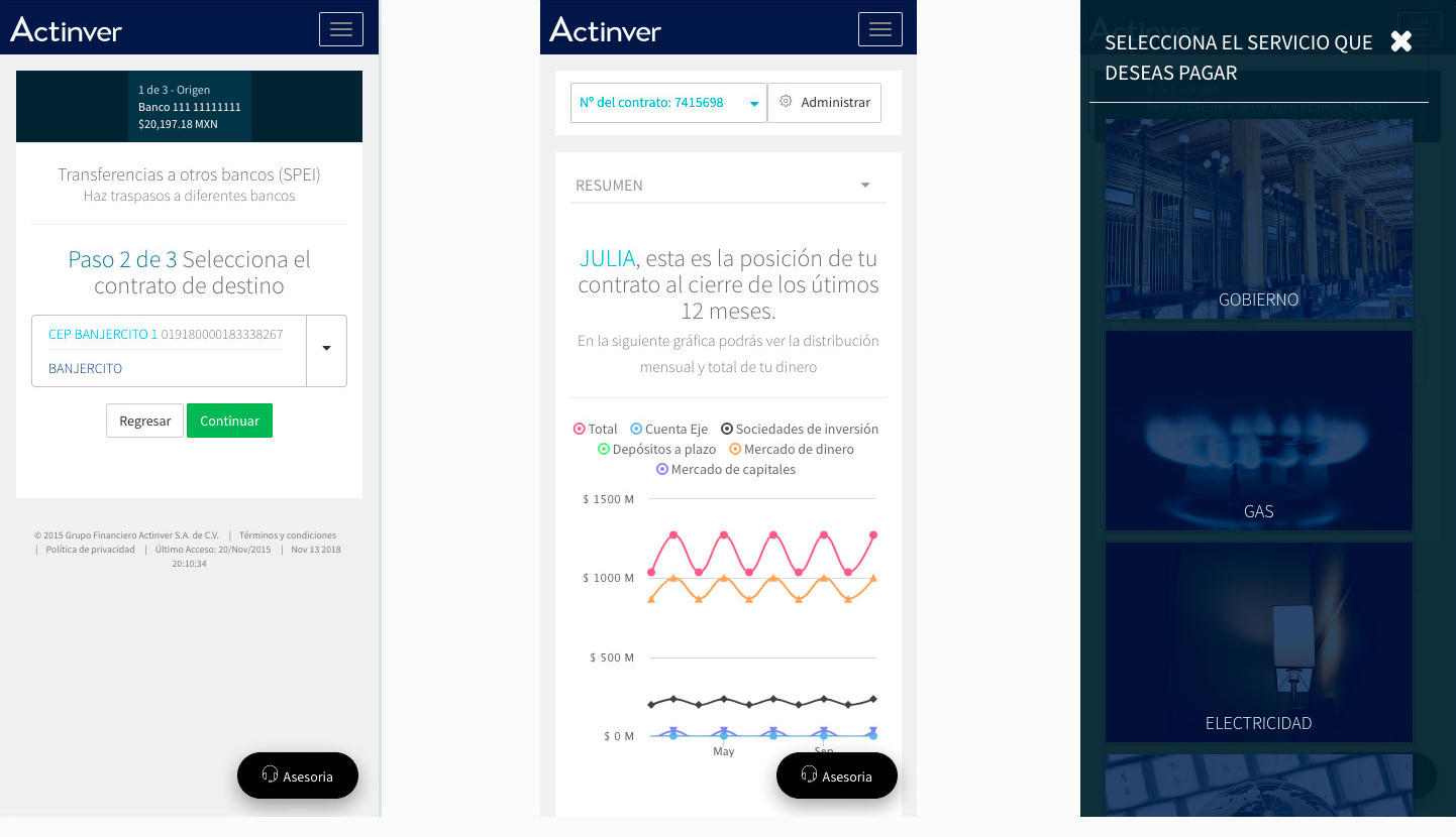
The final interface brought the research, journey mapping and tested interactions into a more consistent digital banking experience.

The V2 reached production after a roadmap informed by MVP interviews and testing. During the quarter following launch, 17,000 users registered for online banking. Alongside that product-level outcome, a satisfaction survey involving approximately 200 respondents reported scores of 2/5 for the first version and 5/5 for the revised experience. These results describe different forms of evidence: registrations after launch and perceived experience in evaluation. They do not isolate design as the sole cause of adoption.

  • Led UX/UI work across research, journeys, wireframes, interface design and validation.
  • Worked with development to turn approved flows and screens into implementation-ready assets.
  • Connected research findings to navigation, transaction and account-information decisions.
  • Core parts of the solution remain in use, according to the project's subsequent follow-up.

App Store Google Play Website