Word Puzzle Game UX Review
This case examines a competitive mobile word game built around a tile board, turns and multiple game modes. My expert review focused on how players move between the home screen and a match, recognize available actions and understand feedback while playing.
Problem statement
The interface mixed game controls, promotions, currencies and social features in a small space. The challenge was to make the next action clear without stripping away the game's character. I used a persona, an empathy map and screen-by-screen review to separate core play from competing visual demands.
-
Date
Feb 2021
-
Client Name
Genera games
-
Tools
Figma
Methodology
UCD approach
I used a UCD approach to compare the needs represented by the persona with what the current screens actually communicated. The review produced recommendations for hierarchy, navigation and in-game feedback.
Empathize
- Personas
- Empathy map
Define
- Expert review
Empathize
Personas
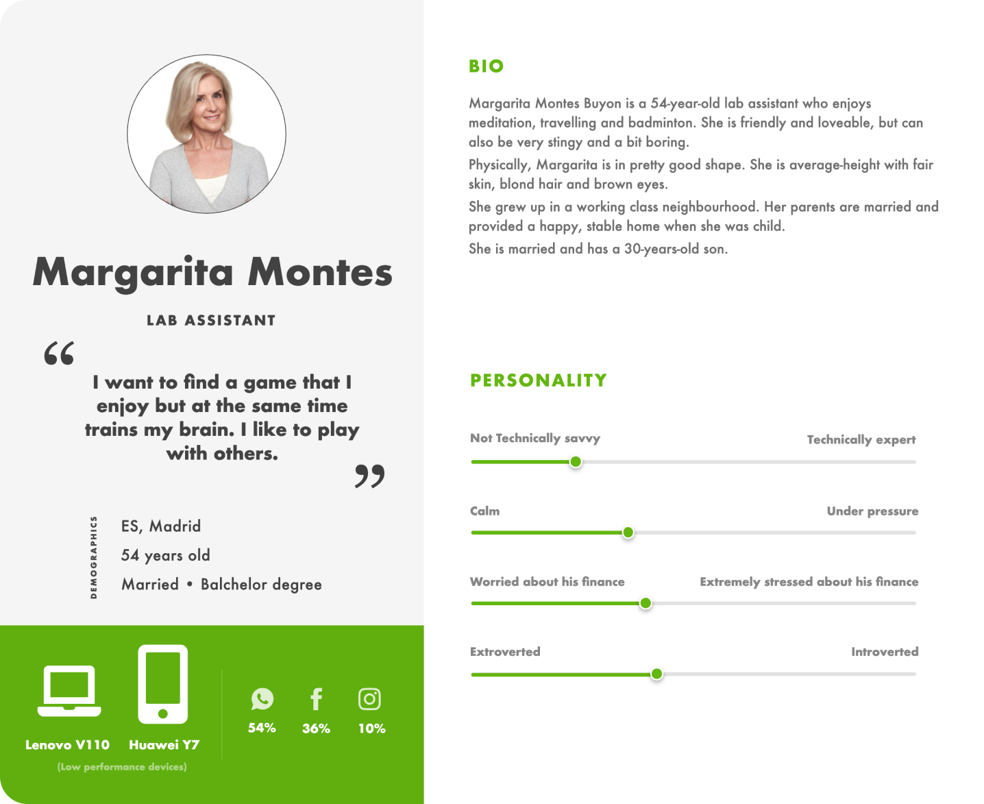
Margarita, the 54-year-old persona shown here, wanted a word game she could enjoy with others without having to decode an unfamiliar interface. I used her goals and lower confidence with technology as a lens for reviewing labels, touch targets and the path from opening the app to taking a turn. The persona is a design aid, not a claim that every player has the same needs.
Research
Empathy map
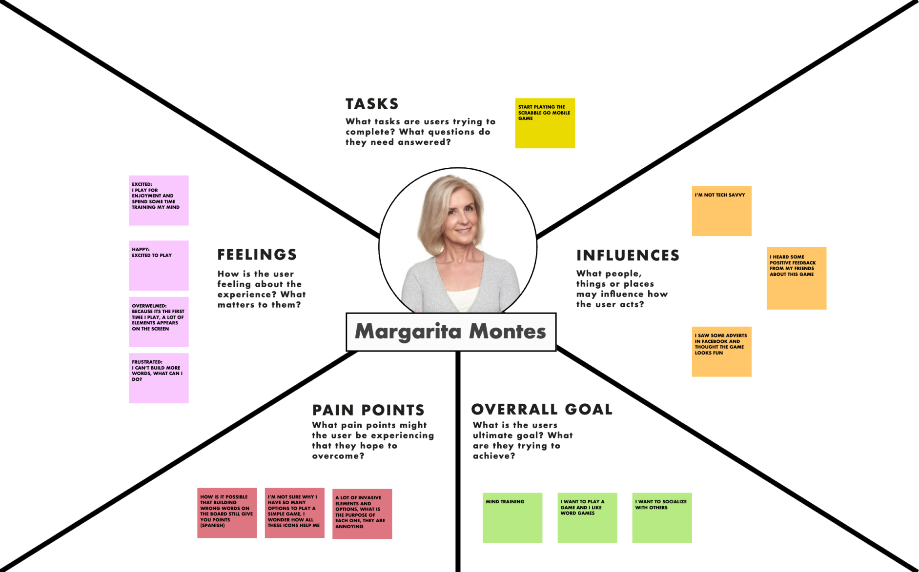
I used the empathy map to examine the moment a player opens the app, chooses a game and returns to an active match.
The map made a practical tension visible: competitive and promotional elements can invite exploration, but they can also obscure the primary action. I carried that question into the review of the home screen and match controls.

Expert review
Visual hierarchy + consistency.
The review found that competing visual elements made it harder to distinguish the puzzle, controls and progress information.
I recommended a stronger hierarchy for the puzzle and its controls, more readable labels and fewer competing prompts. These changes would help players see what to do next without searching across the screen.
I also reviewed consistency between buttons, status messages and game states. Similar actions should look and behave alike so players can reuse what they have learned as they move through the game.
This way they can focus on executing the task and not learning how the product UI works every time they switch contexts.

Expert review
Law of similarity
The home screen uses similar visual weight for currency, notifications, game modes and the main start action. Their proximity and styling make unrelated functions appear to have equal priority.

I recommended grouping account and reward indicators separately from play choices, then giving the current match and new-game action a clearer hierarchy. This would preserve the lively visual style while making the path into play easier to scan.
Expert review
Reducing competing information
The review found several status messages and decorative panels competing with the board. I used the grouping example below to explain why related information should appear together and why secondary details can wait until the player needs them.
Could you remember this secuence as it is?
MCDBMWFERITVRUN
or it is better like this now?
MCD BMW FER ITV RUN

On the game screen, floating panels and a busy background draw attention away from the tiles and turn state. Consolidating status information would give players a more stable place to look before making a move.

Expert review
Choices at the point of play
The board already asks players to choose letters and plan a move. Showing too many secondary actions at the same time adds another decision layer. I recommended keeping turn-critical controls visible and moving less frequent options into a predictable secondary location.

Design recommendations
The deliverable was a prioritized expert review, not a measured increase in engagement. Its clearest recommendation was to protect the route into a match and the decisions made during a turn: reduce competing elements, use consistent controls and make feedback legible at the moment it matters.
- Clarify the hierarchy between the puzzle, controls and progress information.
- Make navigation and the next available action easier to find.
- Use consistent patterns for the same actions across screens.
- Give distinct actions recognizable labels and visual treatments.
- Reduce intrusive prompts and use feedback only when it helps players continue.
- Review Spanish copy and word lists for clarity and correctness.
- Test optional hints and timed challenges before adding them to the core game.