Research
Understanding Keno players
I reviewed player behavior and research material to identify where the Keno journey needed clearer choices and feedback. The findings informed the workshop, flow mapping and later interface work.



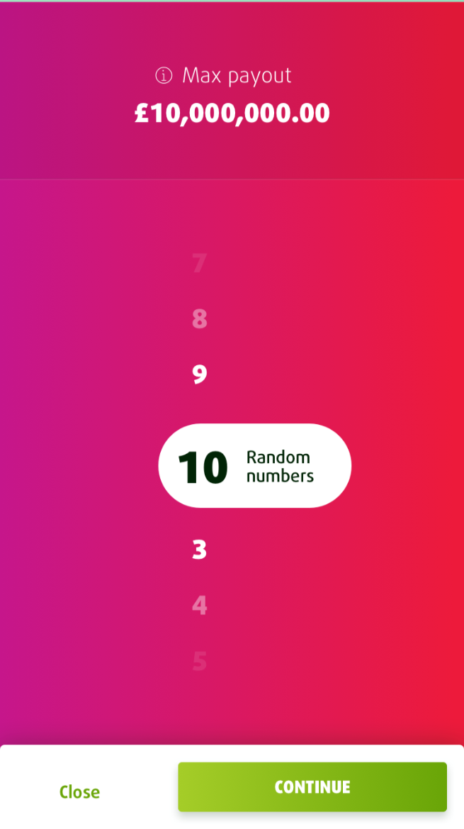
I worked on the Keno experience at Lottoland, using research and workflow design to make game choices and the path to play easier to understand.
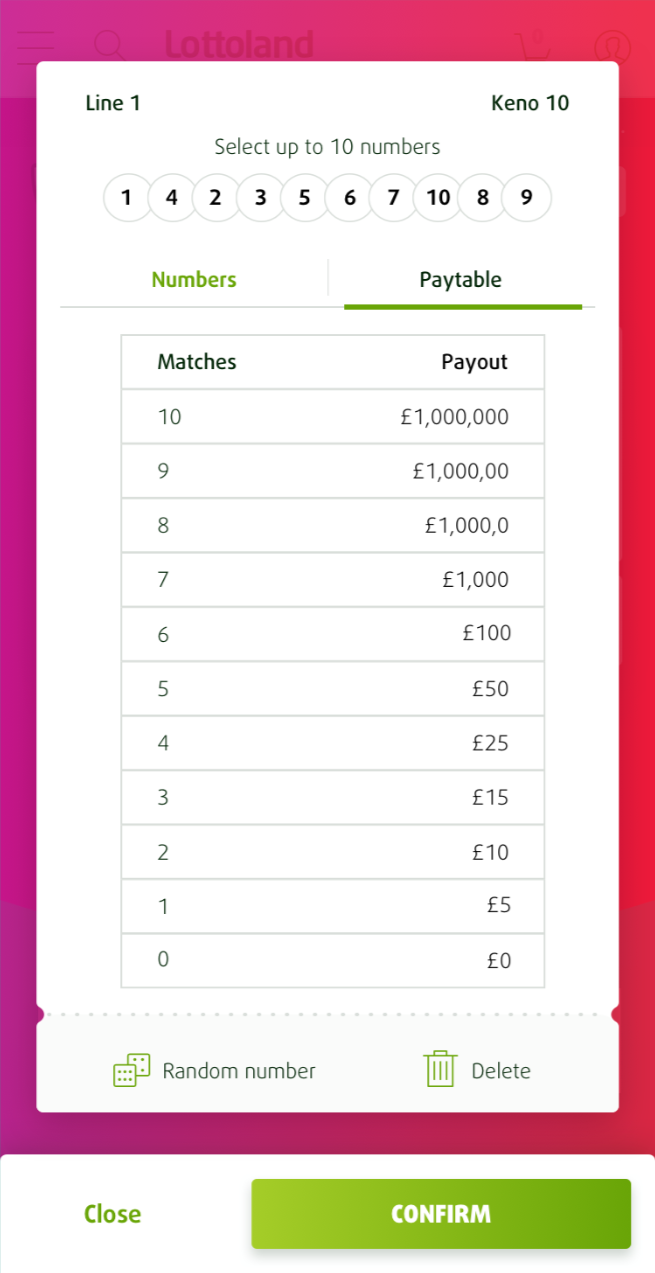
Players needed to understand their selections, the relationship between stake and potential return, and what would happen before confirming a play. I examined these decisions with the team and used the findings to guide the flow and interface.
Dec 2020
Lottoland
Sketch, Flinto, Overflow
I reviewed player behavior and research material to identify where the Keno journey needed clearer choices and feedback. The findings informed the workshop, flow mapping and later interface work.
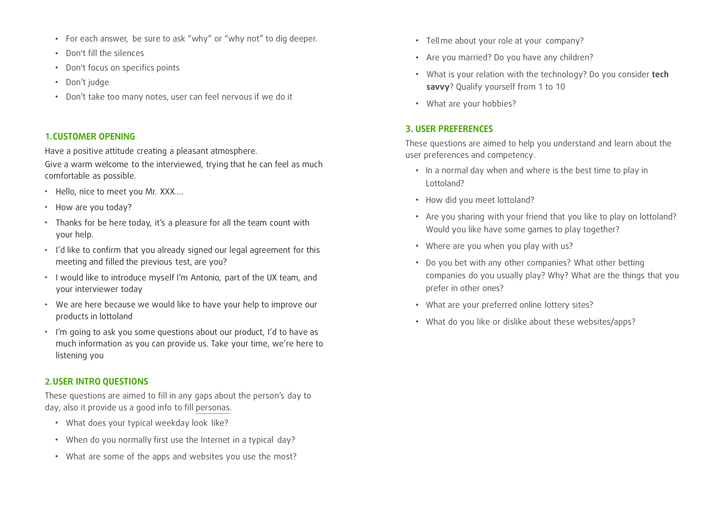
In a short workshop with Product Owners and a developer, I turned the research into focused questions about game choices, feedback and the information players need before placing a bet. This gave the team a shared starting point for exploring solutions.
| User need to | Needed | Why + Insight |
|---|---|---|
| LOTTERY PLAYER |
Place a system bet Play a wheel Review every line combination Select numbers manually Generate random numbers Compare bet options before confirming |
Understand how each bet type changes possible outcomes Compare stake and potential return See the total number of lines in a play Review the numbers selected for each line Complete a familiar play more quickly Understand the trade-off between cost and possible return Know the total stake before submitting |

I prioritized the initial features shown to users and mapped the primary journey to create a clearer, more predictable experience from the start.
The lottery journey was structured to reduce friction and help users understand each step, with clear feedback and guidance throughout the interaction.
By focusing on feature presentation and optimizing the core lottery journey, the design aimed to improve clarity, confidence, and ease of use.
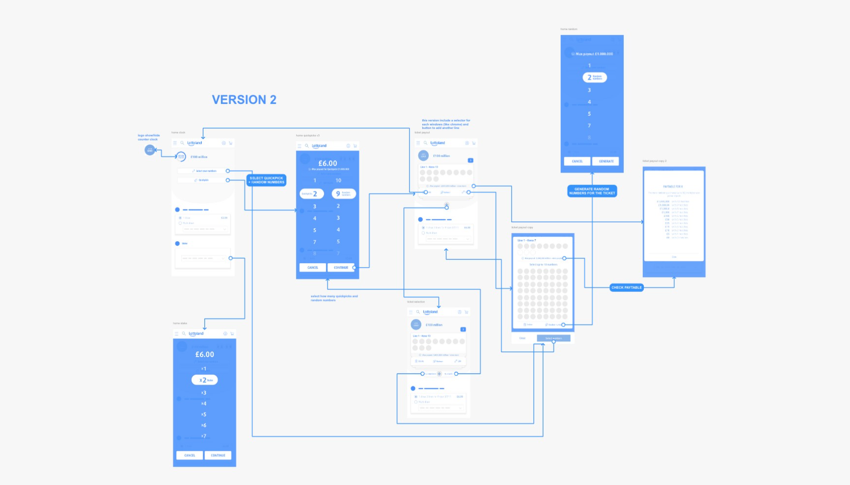
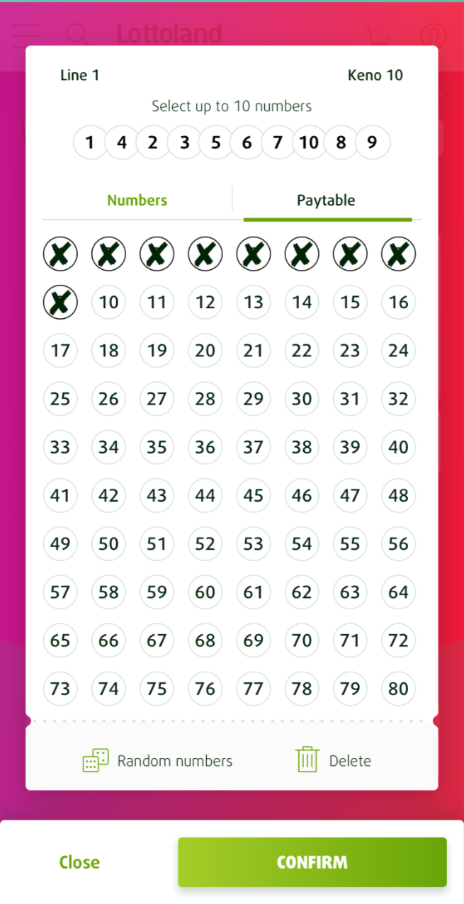
I translated the agreed flows into a high-fidelity Keno interface using an 8px grid. The final design made number selection, stake choices and the state of a play more legible. It is a completed design direction; the case does not include post-launch performance data.