
Review method
From dense data to clearer decisions

Review key screens

Identify friction

Assess severity

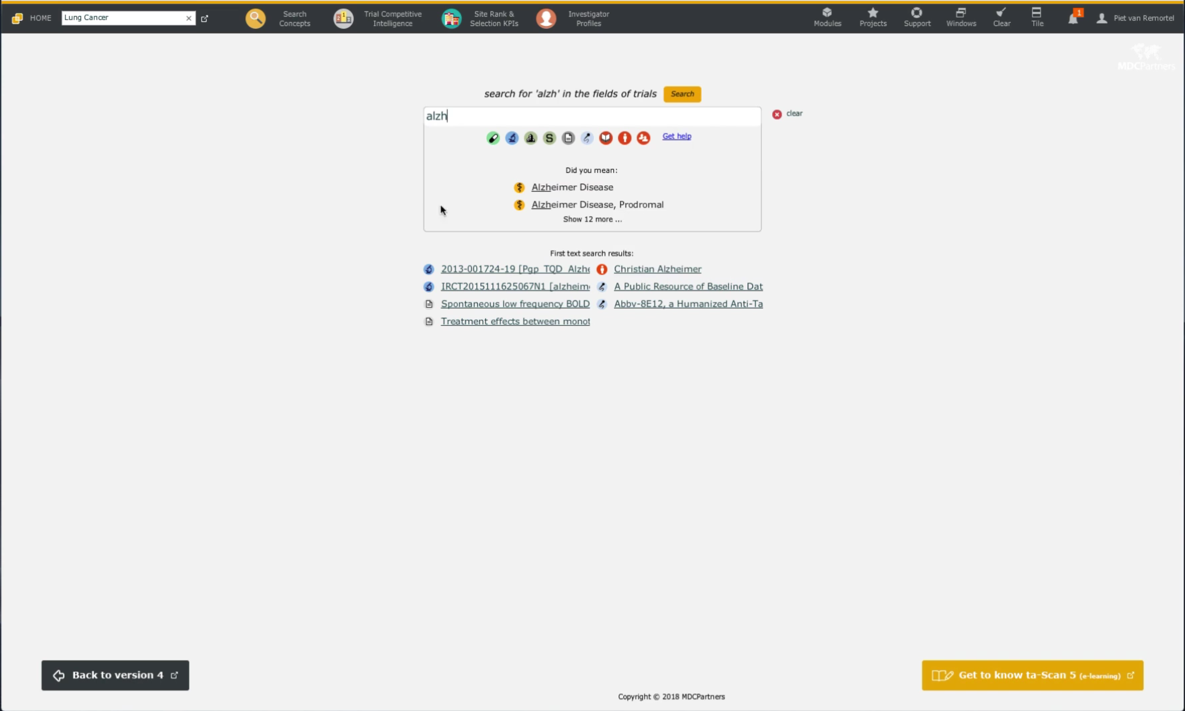
I reviewed how an information-heavy MC Partners interface presented analytical results across screen sizes. The work focused on the path from finding data to interpreting it: navigation, search, chart choice and responsive hierarchy.
The challenge was not a lack of information. It was that dense results and several competing controls made it difficult to see which data mattered and what to do next. I documented usability risks and assembled visual references to make proposed changes discussable with the team.
Dec, 2018
MC Partners
Figma
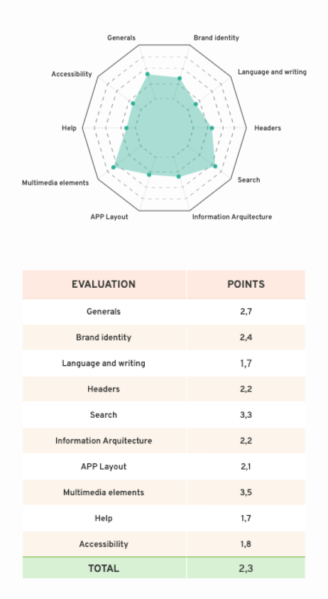
The product exposed substantial detail, but key signals competed with secondary information and the next action was not always obvious.
I recommended organizing the dashboard around the questions users need to answer, choosing charts for the relationships they show and simplifying advanced search. The bars below summarize the audit's areas of concern; they are not measured usability scores.
Task clarity
Navigation clarity
Search efficiency
Result interpretation
Interaction feedback
Data density
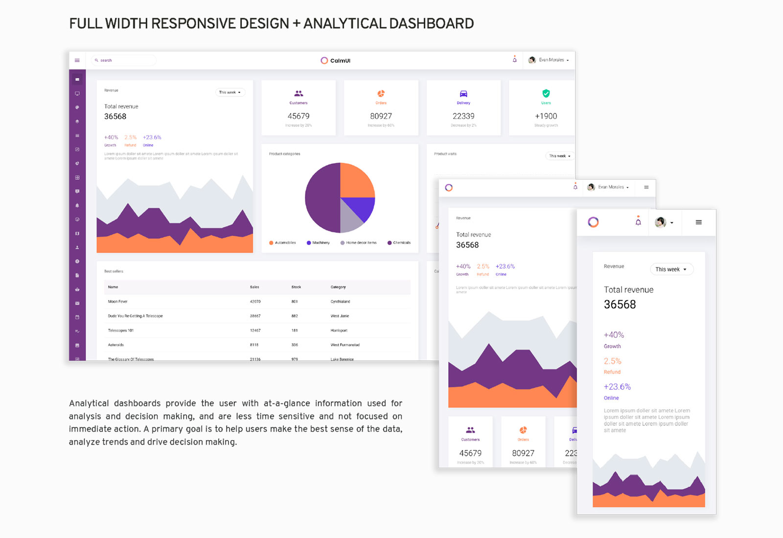
These references illustrate how a responsive dashboard, fit-for-purpose charts and a more focused advanced search might address the audit findings. They are design references, not evidence that those interfaces were built or released for MC Partners.

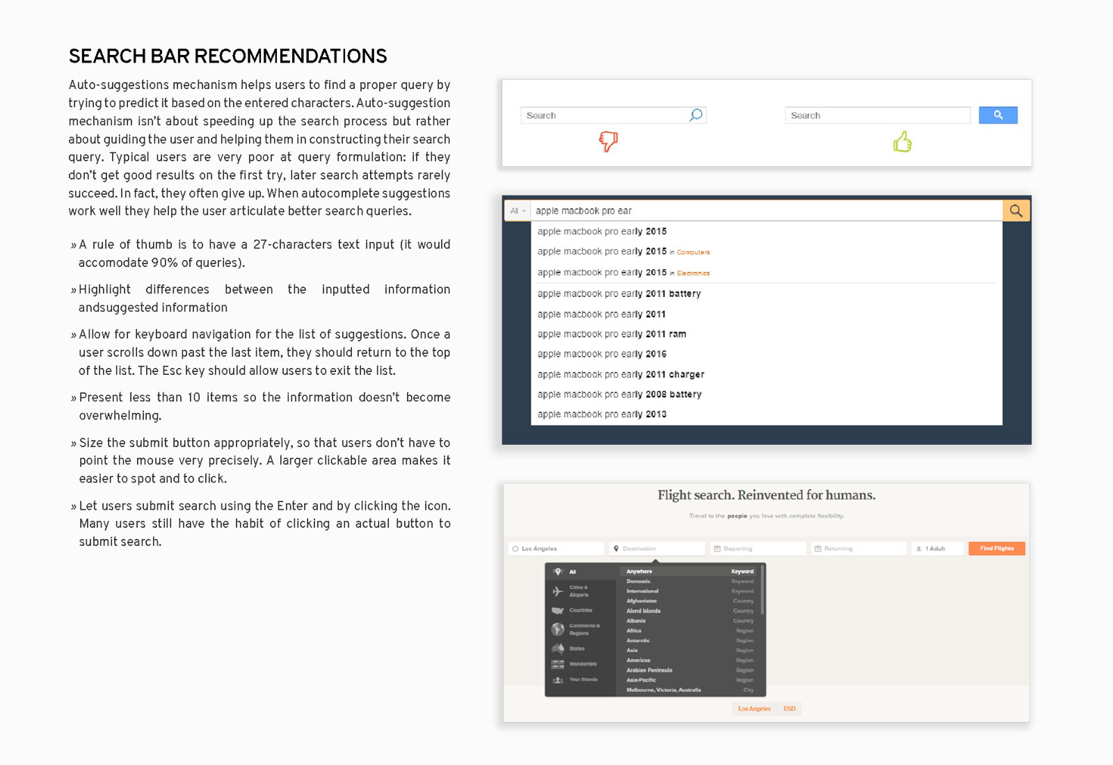
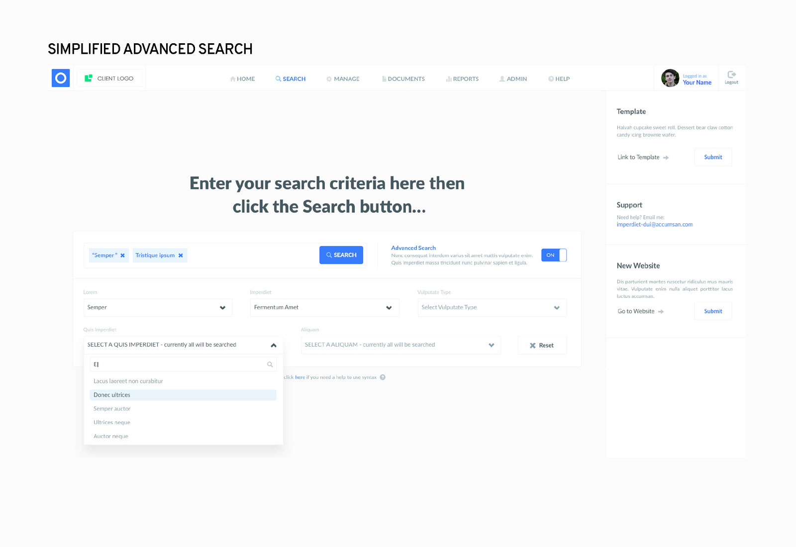

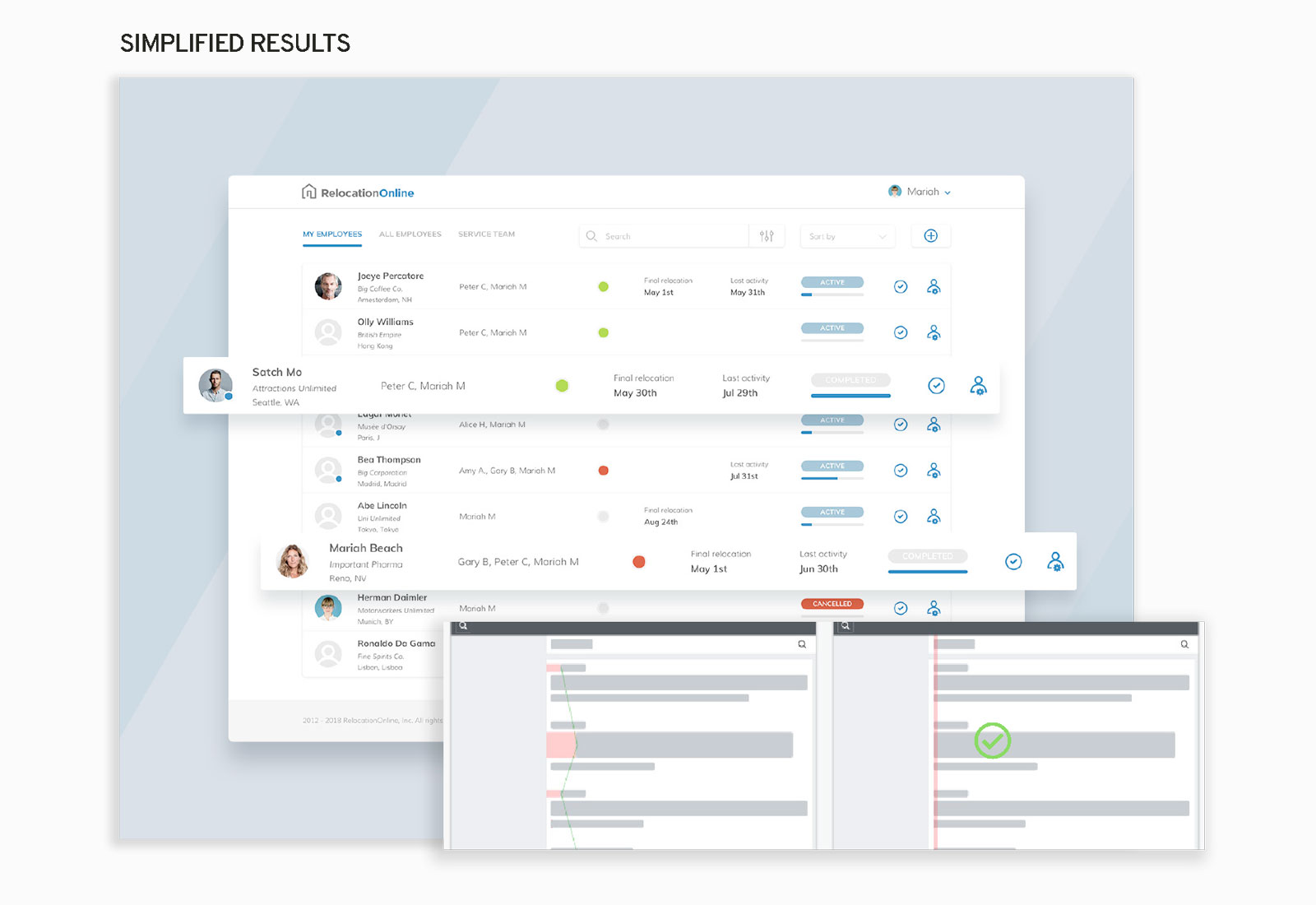
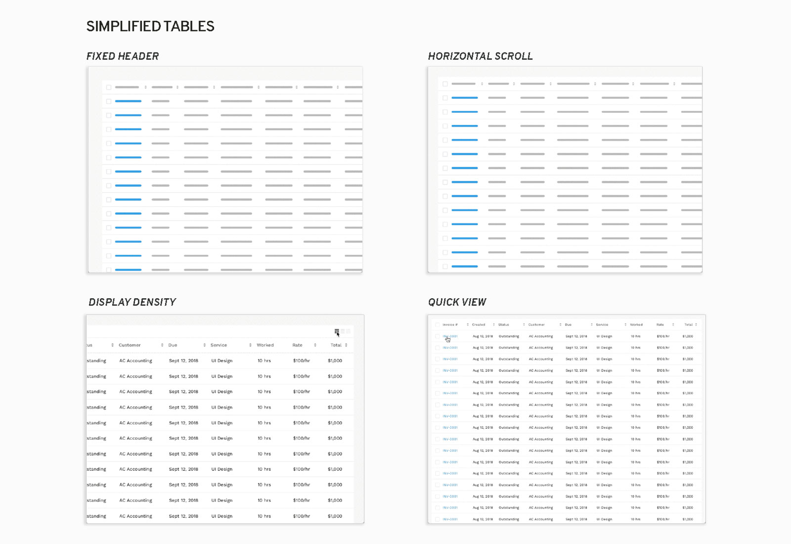
The deliverable was a usability report with priorities the team could act on: clarify the dashboard's primary questions, reduce search complexity and review each visualization against the decision it supports. The case shows an expert assessment and illustrative references. It does not claim implementation or a measured improvement in user satisfaction.