Helping employees access and use their financial benefits
Minu is a Mexican employee-benefits platform that includes earned-wage access. During an extended engagement, I worked from discovery through production delivery on onboarding, utility payments and savings. My contribution connected user research and product priorities to the flows, interactions and interfaces customers would use.
The app brings together financial, physical and mental-health benefits. Employees needed to understand their access and financial responsibilities; HR teams needed a workable route for introducing the service at their companies.
Average monthly registrations increased by 25% when comparing the pre-change baseline with the period following the new version's launch. The increase was observed in the launch quarter. Interviews and usability testing also informed improvements to the experience. Registrations measure product uptake, not ongoing activity or retention, and the design contribution was not isolated from other factors.
Problem statement
Different access models, employer involvement and third-party integrations made a single generic journey insufficient. The challenge was to explain eligibility and financial services clearly while reducing friction in registration and everyday transactions. I combined analytics, surveys, interviews and market research to identify where customers needed better information, guidance or a revised flow.
-
Date
September 2020
-
Client Name
Minu
-
Tools
Figma, Mural, Overflow.io
Research
Competitive analysis
I conducted a competitive analysis of salary-on-demand products to understand market maturity, identify strengths and weaknesses, and uncover opportunities for Minu’s product roadmap.
I also reviewed real-user sessions from competing apps to identify usability patterns, friction points, and opportunities that could inform Minu’s experience.
I translated the comparison into design opportunities for Minu's roadmap, separating common market patterns from issues that needed validation with its own users.


Research
Survey
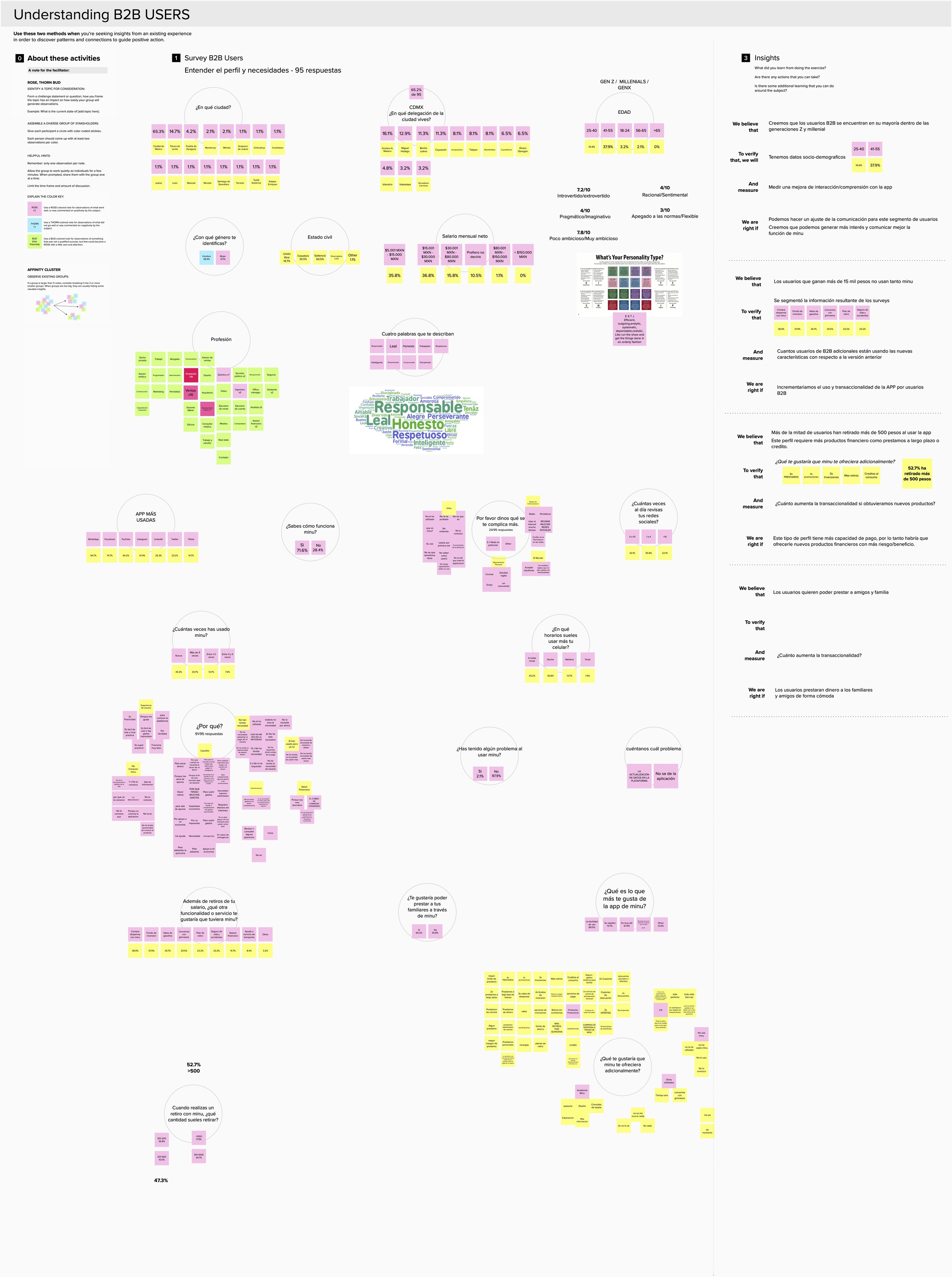
I used analytics to identify audience segments and designed a survey to test assumptions about how employees understood and used earned-wage access. With another UX designer, I also reviewed how product limits were communicated so the experience supported informed financial decisions.
The research distinguished employer-managed access from models in which employees carried more repayment responsibility. That difference mattered for eligibility, language and the safeguards users needed to understand.
Survey findings helped identify which benefits users valued, which terms needed clearer explanation and where the app could reduce uncertainty in the access journey.
I combined the survey responses with behavioral data and the competitive analysis to build more useful audience profiles for subsequent product decisions.
Define
Empathy map
I used the empathy map to bring research findings into product discussions: what employees understood about the benefit, what they expected from it and where the experience left them uncertain. This kept attention on the decisions users needed to make, rather than treating every requested feature as equally valuable.
With the UX team, I brought together stakeholder input and recurring issues raised by Customer Support. We used that evidence alongside direct research to distinguish business expectations from user needs and identify questions that required further validation.



Define
Personas: different responsibilities, different journeys
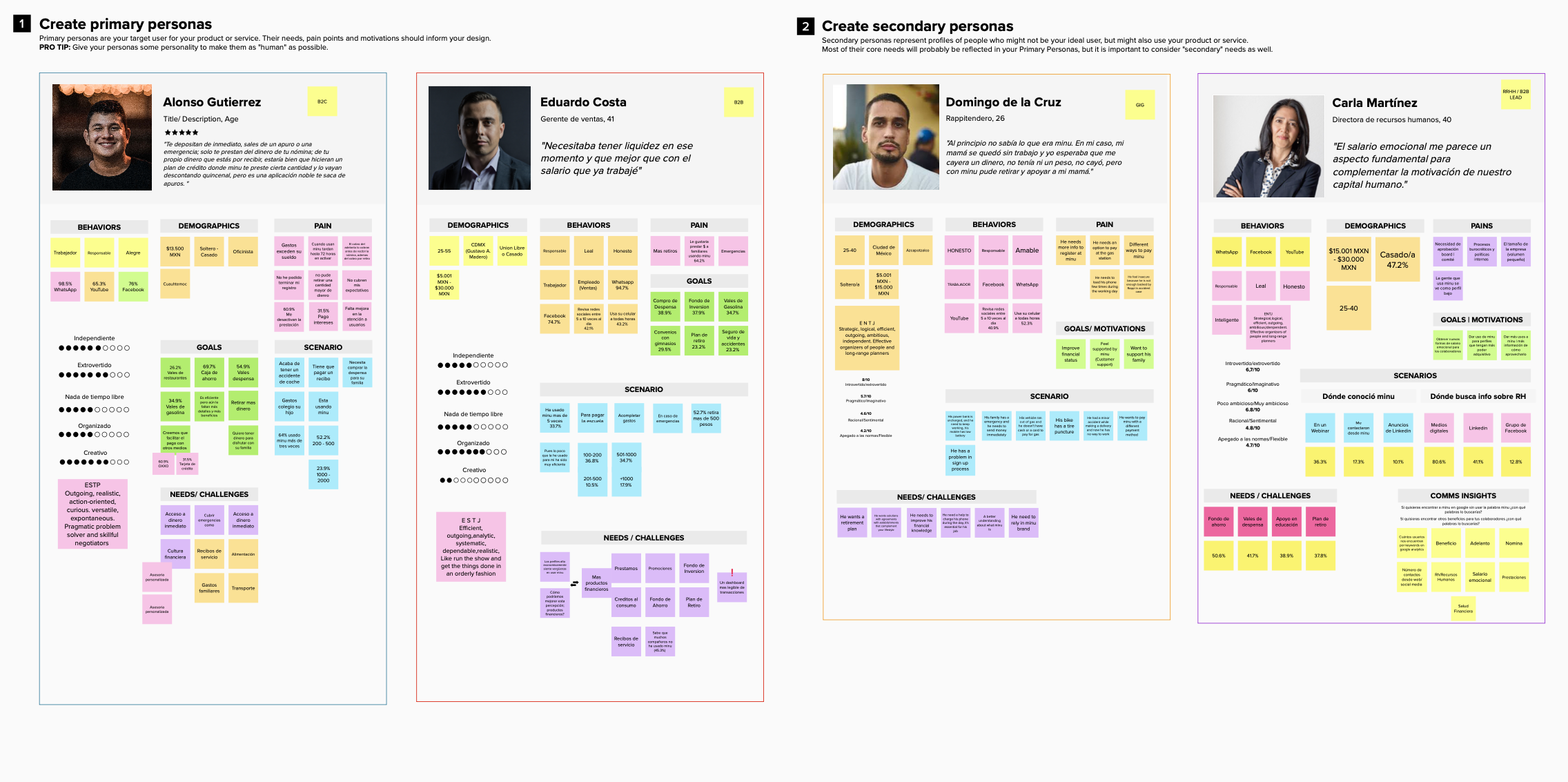
After synthesizing research and sociodemographic information, I created three personas to give Product and Marketing a shared view of the audiences and their needs. The personas helped connect research findings with product and communication decisions.
- Employees with employer-provided access: understand which benefits their company offers and how to use them.
- Users responsible for repayment: understand the financial obligations associated with their access model before proceeding.
- HR managers: assess the service for their workforce and participate in introducing it to employees.
Discover + define
Value proposition canvas
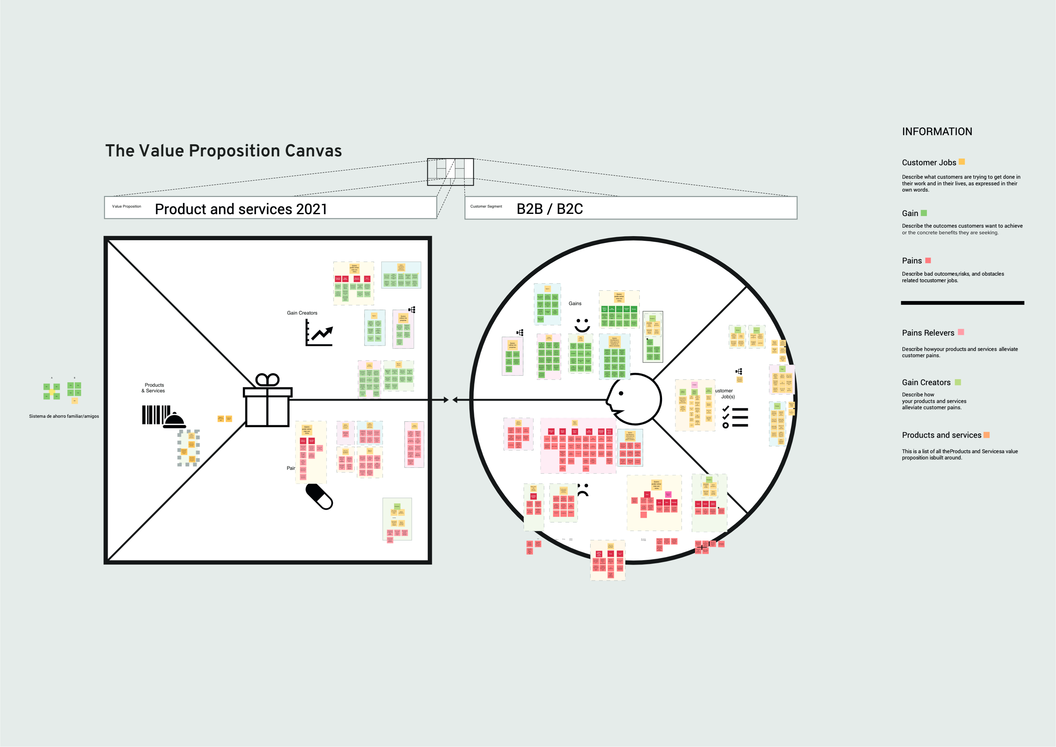
I ran a workshop to turn the research into a shared set of product opportunities. We connected user needs and frustrations to potential improvements, then used a prioritization matrix to discuss which changes should inform the roadmap.
The decision was to prioritize opportunities against the research rather than expand the feature list by default. Product, design and development could review the same evidence and discuss the value and feasibility of each direction.
Customer profile - right side
Consolidated what each audience needed to achieve, the friction they encountered and the benefits they expected. Employees and HR managers had different responsibilities, so those needs were not treated as interchangeable.
Value map - left side
Connected those needs to possible changes in service communication, onboarding and financial features. The map made the intended value of a proposal explicit before it became a design task.
USP - Unique Selling Proposition
The workshop gave the team a basis for explaining why an opportunity mattered to a particular audience. Proposed benefits were taken into subsequent design and validation work, rather than assumed to be valuable because they appeared in the market comparison.

Define
User Journey map
I owned the mapping of a complex B2C registration journey while other UX team members examined complementary journeys. The map connected customer actions, points of uncertainty and service dependencies so we could investigate where signup broke down.
- Locate confusing transitions in the registration sequence.
- Understand where customers needed help from support.
- Clarify benefit descriptions and financial responsibilities.
- Identify third-party dependencies affecting the journey.
The mapping exposed a conflict involving a third-party integration. This mattered because interface changes alone could not resolve every registration problem: the product journey also had to account for the service it depended on.
I brought these findings into the product discussion alongside opportunities raised by users, helping the team separate journey problems from requests for additional features.


Develop
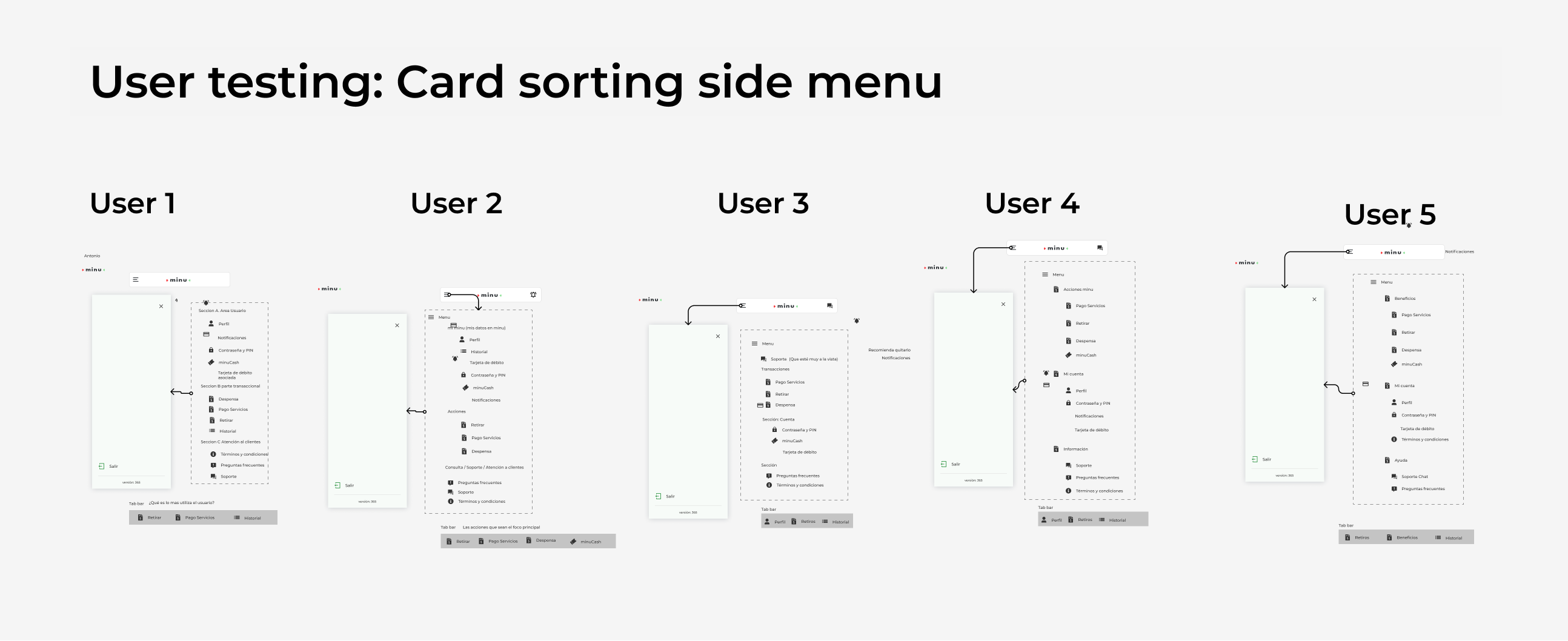
Wireframes + User
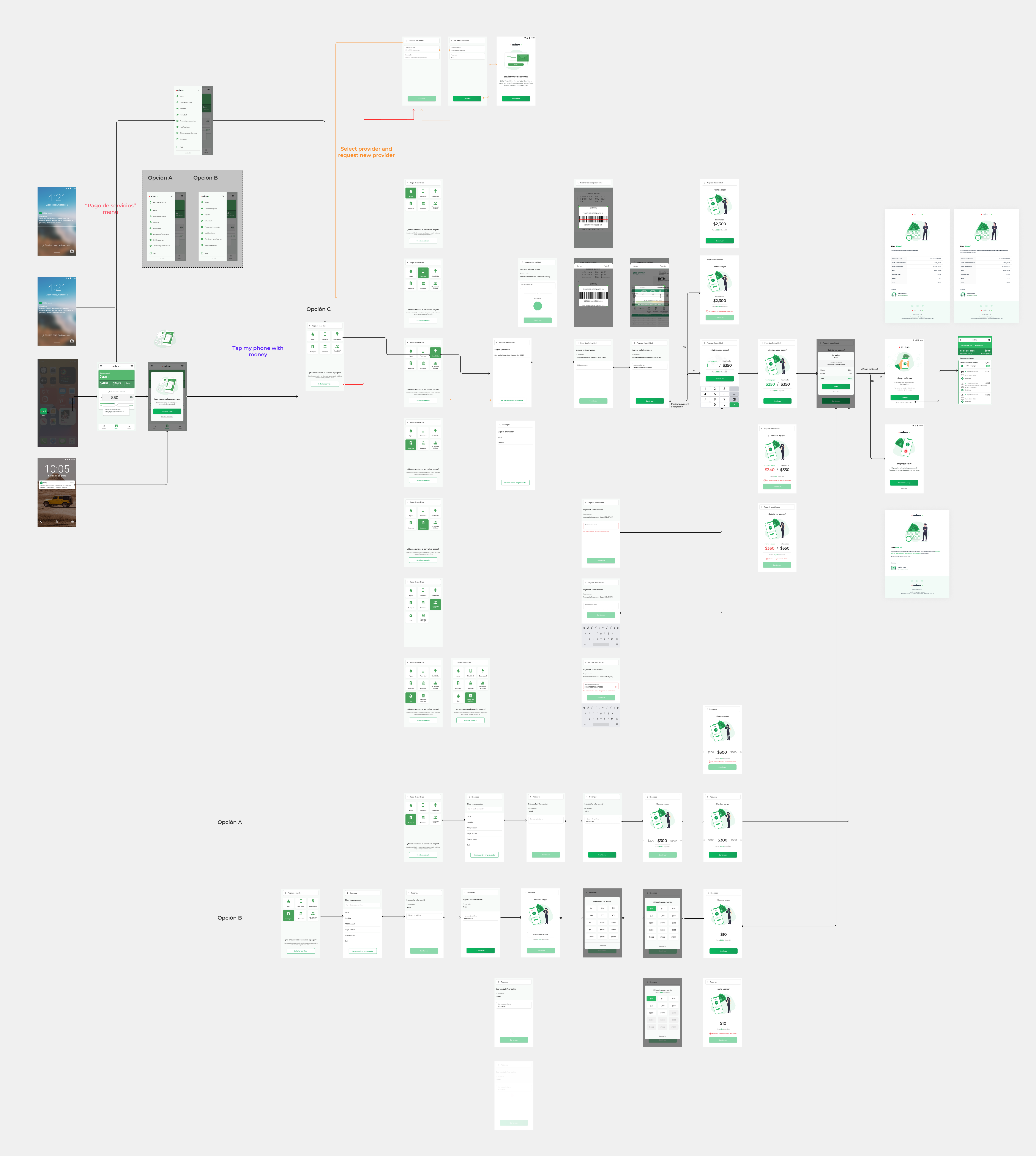
flows for payment integration
I worked with Product on a utility-payment integration, translating the research into user flows, wireframes and high-fidelity screens. Customers could pay services such as gas and electricity within Minu. The designs connected the new service to the app's existing experience instead of treating it as an unrelated payment journey.
UI Design
UI + microinteractions
With the UX team, I reduced competing interface elements so the main transaction remained clear. The interaction recording shows the payment experience in sequence, complementing the static screens. Interviews and testing informed revisions before production delivery.


UI Design
Wireframes + User flows + UI
for Onboarding

Onboarding depended on both the employee experience and the company's HR team. I reviewed the existing signup flow, developed wireframes and high-fidelity designs, and introduced more consistent interaction patterns. Testing and interviews informed revisions to clarity and usability. The objective was to reduce avoidable effort without hiding the differences between access models or the responsibilities users needed to understand.




Project outcome
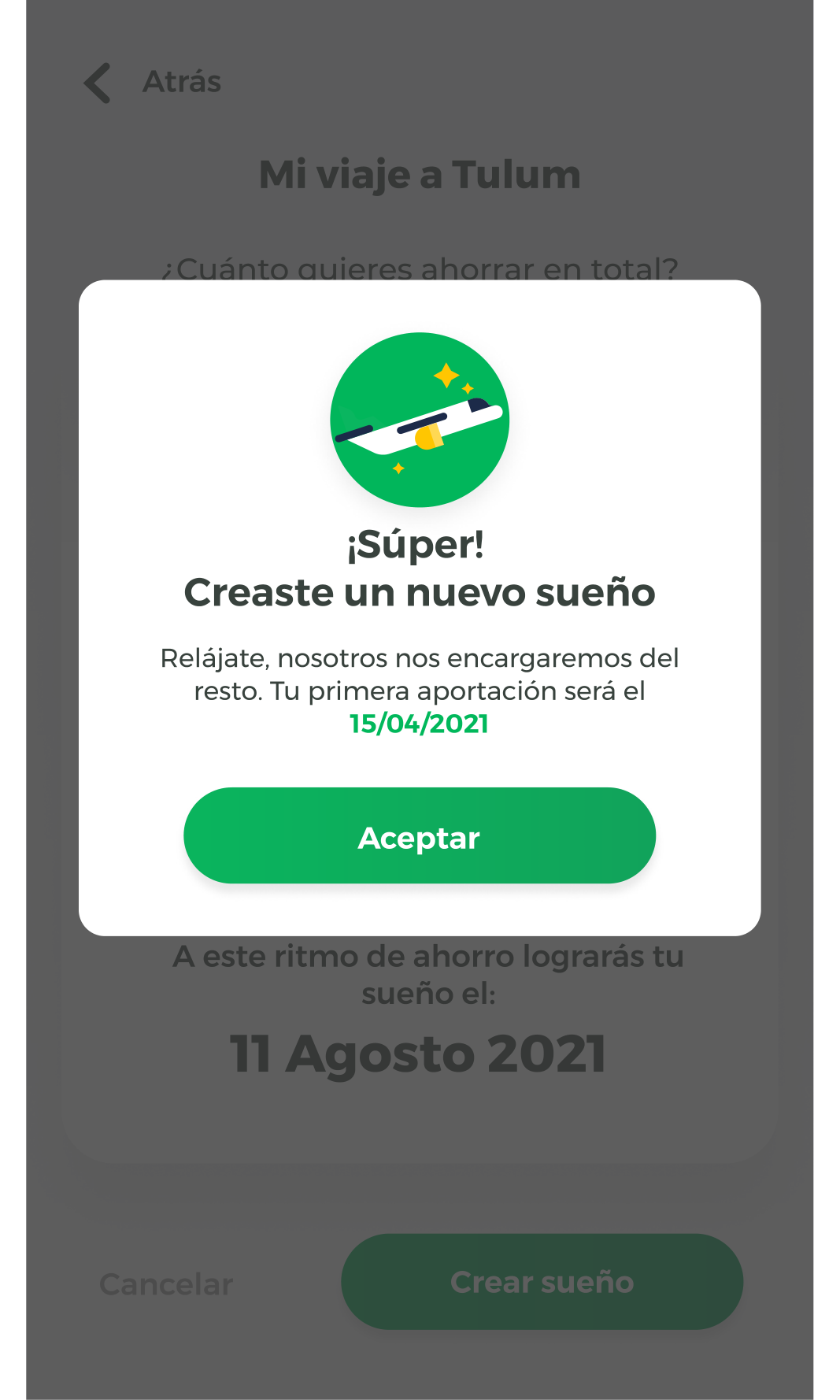
Onboarding, utility payments and savings reached production during the engagement. My work connected discovery, prioritization, flows, UI design and user validation across those areas, with Product and the wider UX team. Interviews and usability testing helped us revise the experience and assess users' satisfaction with the proposed improvements.
Average monthly registrations increased by 25% against the pre-change baseline in the quarter when the new version launched. This was the adoption measure: the average number of users registering each month before the changes compared with the average after them. Registration friction had been a priority for the work, so this outcome was relevant to the onboarding improvements. It does not establish an increase in active use or retention, or isolate the effect of design from other factors. The delivered experience connected clearer audience needs and reviewed journeys to onboarding, payment and savings features in production.