Improving diamond sourcing at Nivoda

Nivoda is a B2B marketplace where jewelers source and purchase diamonds. As the catalogue and product expanded, buyers needed clearer ways to filter inventory, compare similar stones and place repeat orders.
As Lead Product Designer at Holux, I worked with Nivoda’s Product, UX/UI and Customer Support teams to identify usability issues, uncover customer needs, and translate research insights into product improvements.

Problem statement

Despite strong traction in the jewelry industry, Nivoda’s platform had growing complexity as more features and suppliers were added. The main challenges were:

  • Navigating large volumes of similar diamond listings.
  • Understanding differences between similar products quickly.
  • Completing repeat orders efficiently.
  • Interpreting filters, pricing and purchase information with confidence.

Nivoda also needed deeper customer insight to prioritize short-term usability improvements while informing longer-term product and roadmap decisions.

  • Date

    Mar 2022

  • Client Name

    Nivoda

  • Tools

    Benchmark, Personas, User Flows, Wireframes, Prototypes, UI


Research

Stakeholder Alignment

During the project, Holux worked closely with different internal stakeholders:

  • Product Managers to align priorities with the roadmap.
  • Customer Support to review recurring friction points.
  • UX/UI Designers to translate insights into actionable improvements.

Weekly reviews connected customer feedback with the roadmap. We used them to agree which search, comparison and ordering problems to address first, then checked proposed changes with the relevant teams.
Define

User Insights

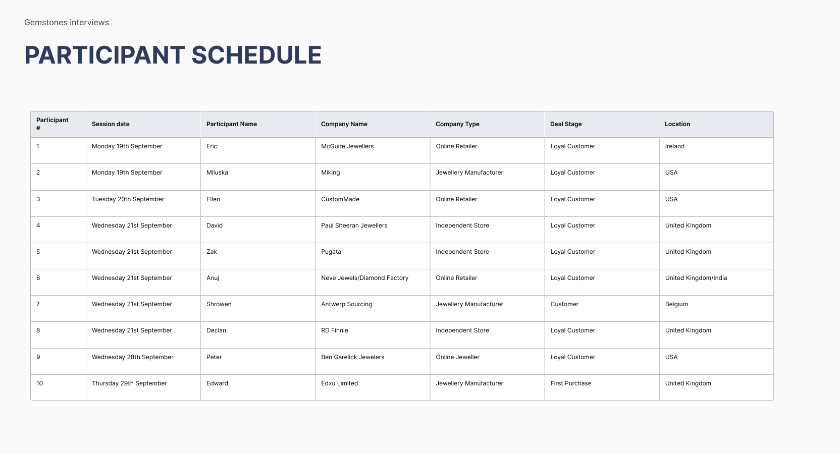
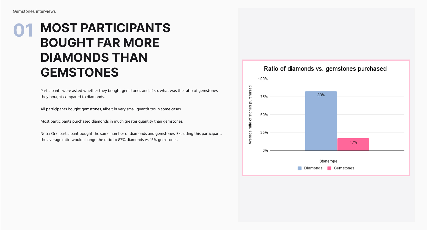
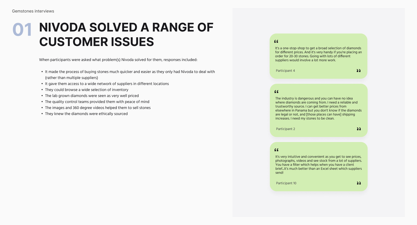
To better understand how jewelers interacted with Nivoda’s platform, we conducted remote user interviews and distributed targeted surveys. This mixed-methods approach helped validate internal assumptions and uncover pain points rooted in real behavior and expectations.

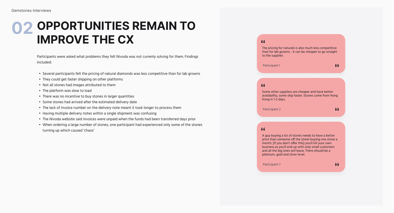
  • Unclear comparison: Users struggled to distinguish meaningful differences between similar diamonds, reducing confidence during decision-making.
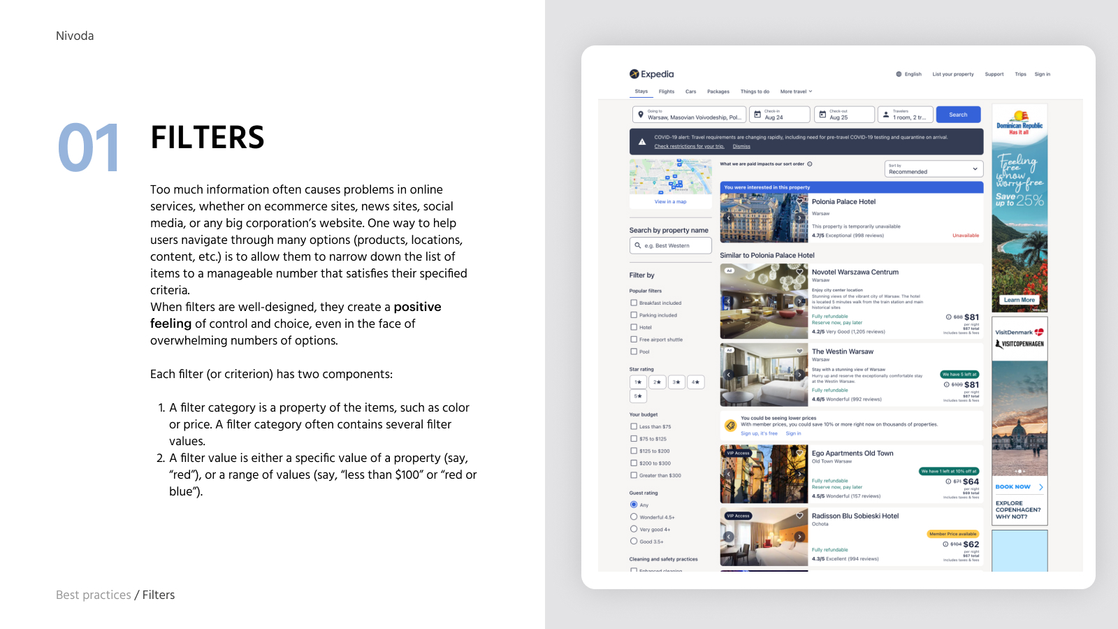
  • Confusing filters: Some filter attributes were difficult to understand or behaved differently from users’ expectations, leading to frustration and less relevant search results.
  • Inefficient reordering: Returning users had no efficient shortcut to frequently reordered inventory, creating unnecessary steps in a repetitive workflow.
  • Ambiguous microcopy: Technical or unclear language around pricing, availability and purchase terms created uncertainty during the buying process.

These findings set the design priorities for filtering, comparison, repeat ordering and purchase language. Conversion was a product objective, not an outcome measured in this case.


Research

Design recommendations

After the research phase, I translated the main customer pain points into actionable UX recommendations:

  • Filtering: restructured categories, hierarchy and labels to make search criteria easier to understand.
  • Comparison: redesigned the comparison experience to surface the most relevant product differences.
  • Reordering: streamlined the workflow and introduced quicker access to previous purchases.
  • Microcopy & visual cues: reviewed terminology, icons, badges and alerts to improve clarity and confidence.

Defining

Figma Design System Manager

I organized the Figma component library so designers could reuse established patterns across product areas and hand off consistent states to development.

Key Components Delivered:

  • Typography styles aligned with hierarchy and readability standards.
  • Color tokens for consistent hierarchy and brand use.
  • Reusable components (buttons, inputs, tags, cards) with clear naming conventions.
  • More than 100 reusable components documented in the library.
  • Variants and auto-layout logic for flexible, responsive usage.
  • Documentation and usage guidelines to onboard new designers and improve team handoff.

How it improved the product at Nivoda:

  • Consistency: Shared components gave teams a common reference for repeated patterns.
  • Iteration: Designers could assemble and revise flows using existing states and variants.
  • Coverage: The library supported work across multiple product areas.
  • Handoff: Naming and usage guidance made design decisions easier to discuss with engineering.

UI Design

UI and Master Components

Key Improvements Delivered:

  1. Comparison: redesigned the interface to surface relevant diamond specifications and reduce decision friction.
  2. Filtering: introduced clearer categories and more intuitive filtering logic.
  3. Reordering: streamlined access to previous purchases for returning users.
  4. Microcopy: clarified pricing, availability and purchase terminology to reduce uncertainty and cognitive load.

Research and design outputs

Research with jewelers made the trade-offs in search, comparison and repeat ordering visible. I translated those findings into interface changes and a reusable component library so that product, design and engineering could work from the same priorities.

The work produced revised buying flows and more than 100 documented components in Figma. These outputs gave Product, Design and Engineering a shared basis for reviewing patterns and continuing the work. The evidence presented here covers research and design delivery; post-launch engagement and conversion were not measured within this case.

Project outputs:

  • Research findings organized around search, comparison and repeat ordering.
  • Revised flows and UI recommendations for recurring buying tasks.
  • More than 100 reusable components in the Figma library.
  • Shared design references for Product, Design, Engineering and Customer Support.
  • Documented priorities for the next product iterations.